

01 — THE PROBLEM
05 — BEFORE & AFTER

What changed, and why it matters
04 — CONCLUSION

What I learned
This project started with a simple observation: a mundane everyday task was being made harder than it needed to be. Working through the audit, the sketches, and the redesign sharpened my instinct for separating what I noticed as a designer from what actually mattered to the user. The machine list wasn't broken because it was ugly. It was broken because it made people think when they shouldn't have to. That distinction shaped every decision I made.
"Why does it take so many taps just to start a machine?”
"There’s too many screens you have to get through”
USER PERSONAS
USER PERSONAS
GOAL Start wash quickly and get back to whatever he was doing before
GOAL Get laundry done quickly without worrying about her phone
JAKE S. 28
- Marketing coordinator in hospitality
- Plays in a weekly pickle ball league
- Does laundry every two weeks
NAOMI W. 37
- HR Director in Healthcare
- Loves to travel and host dinner parties
- Does laundry every week
02 — USER PERSONAS

Who we’re designing for
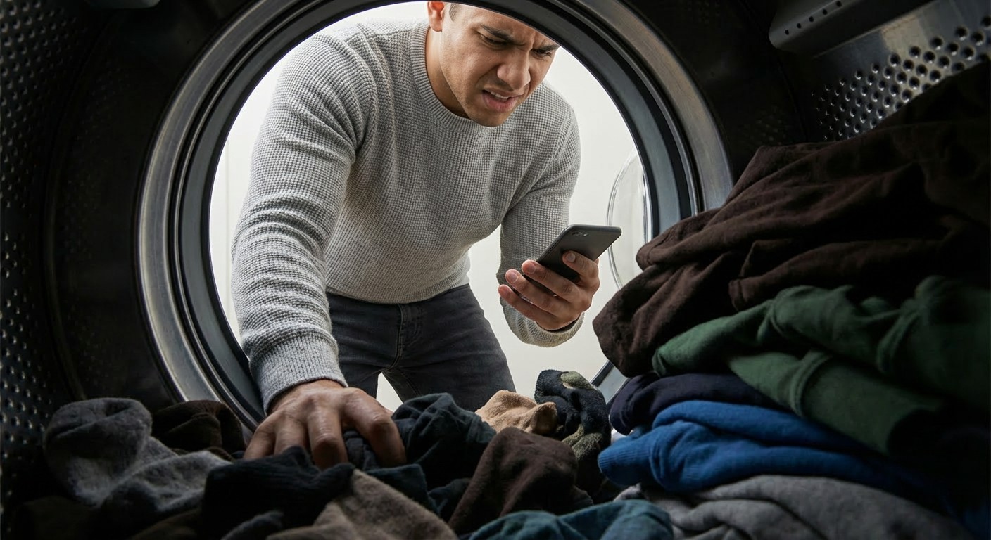
A simple task got bogged down with too many screens
Residents just wanted to pay and walk away. The app made that harder than it needed to be. T
01 — THE PROBLEM

Research and
Data Collection
Wash-Connect users are a captive audience because they can't switch to a competing app, so traditional drop-off metrics tell us nothing. Instead, the most valuable data would come from moderated usability tests, watching recruited test users attempt to start a laundry cycle in real time. Heatmaps would reveal hesitation patterns across each screen, and in-app surveys would pull real life user frustrations.
I started by mining unsolicited public feedback across the App Store, Google Play, Reddit, community forums, and X (formerly Twitter). Because this feedback is unprompted and comes from unrelated users, it carries strong signal. I looked for recurring frustrations appearing independently across platforms, if the same complaints showed up across unrelated users, that was early validation the problem was real and worth solving
First, I audited direct competitors in the laundry payment space to understand the current market standard. Second, I looked beyond the category entirely, studying tap-to-pay apps across transportation, parking, transit, and vending. Across both, I evaluated tap count, error recovery, visual hierarchy, feedback states, and wayfinding clarity to identify what a smooth experience could look if done well.
Auditing
Comparable Apps
Analyzing Public
Online Reviews
03 — RESEARCH & DISCOVERY
Understanding the problem from multiple angles

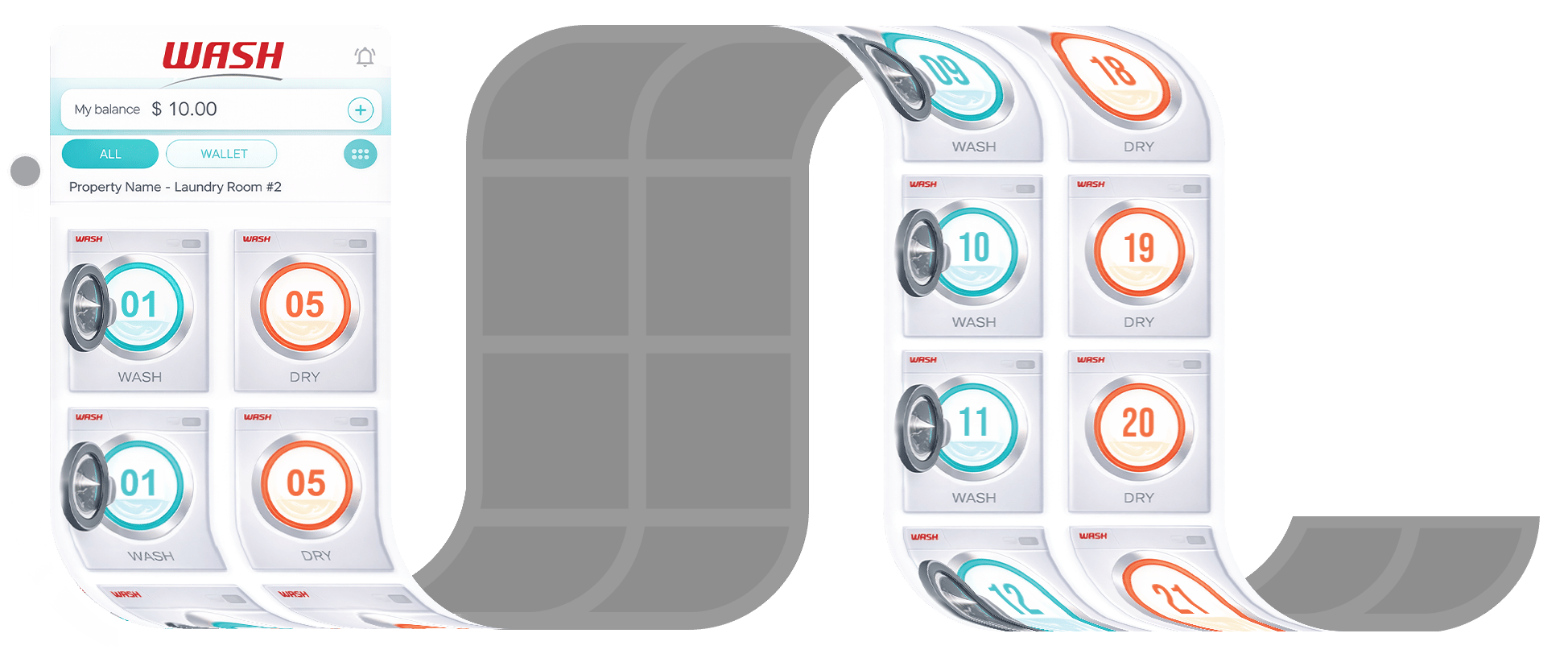
- Machine Icons Don’t Change to Show Availability Status
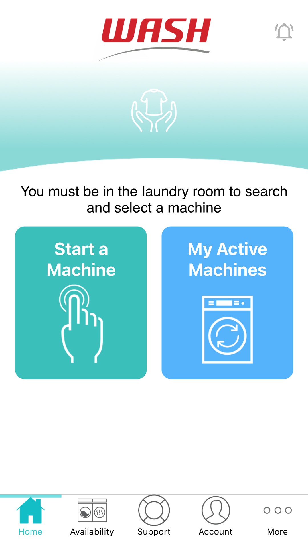
Icons on the machine list gave no indication of whether a machine was in use or available. To confirm availability, users had to physically locate the machine, note its number, and cross-reference it in the list. A separate "Your Active Machines" screen existed but required navigating back and tapping into a different section entirely.
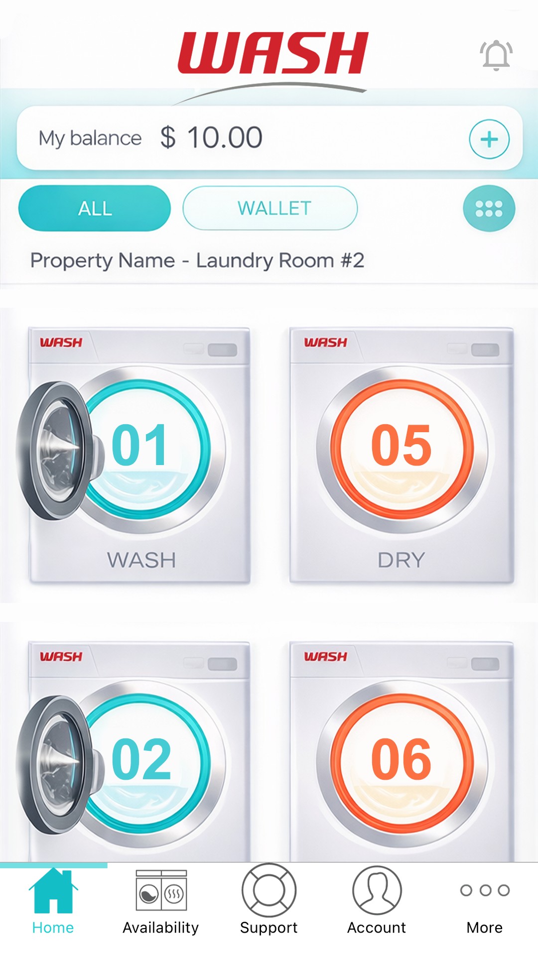
In Use
Free
04 — UX AUDIT
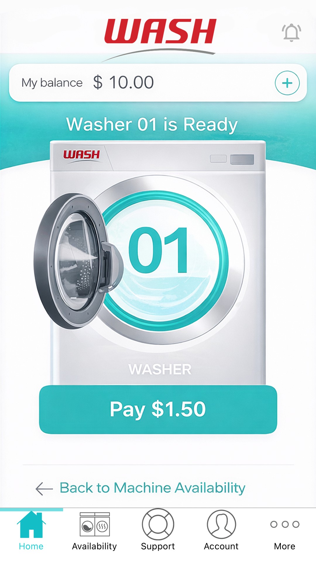
- Starting a Machine Required Four Taps
The login page surfaces too many options upfront rather than tucking secondary actions into settings post-login. From there, users pass through two more screens before reaching a machine icon, which requires a final tap to reveal the pay option.
Login
Menu
Select
Pay

- Scroll Position Reset to the Top of the Page After Each Payment
After paying, the app returns to the machine list but resets to the top of the page. With a long list and oversized machine icons, users must scroll a significant distance back down to select their next machine.
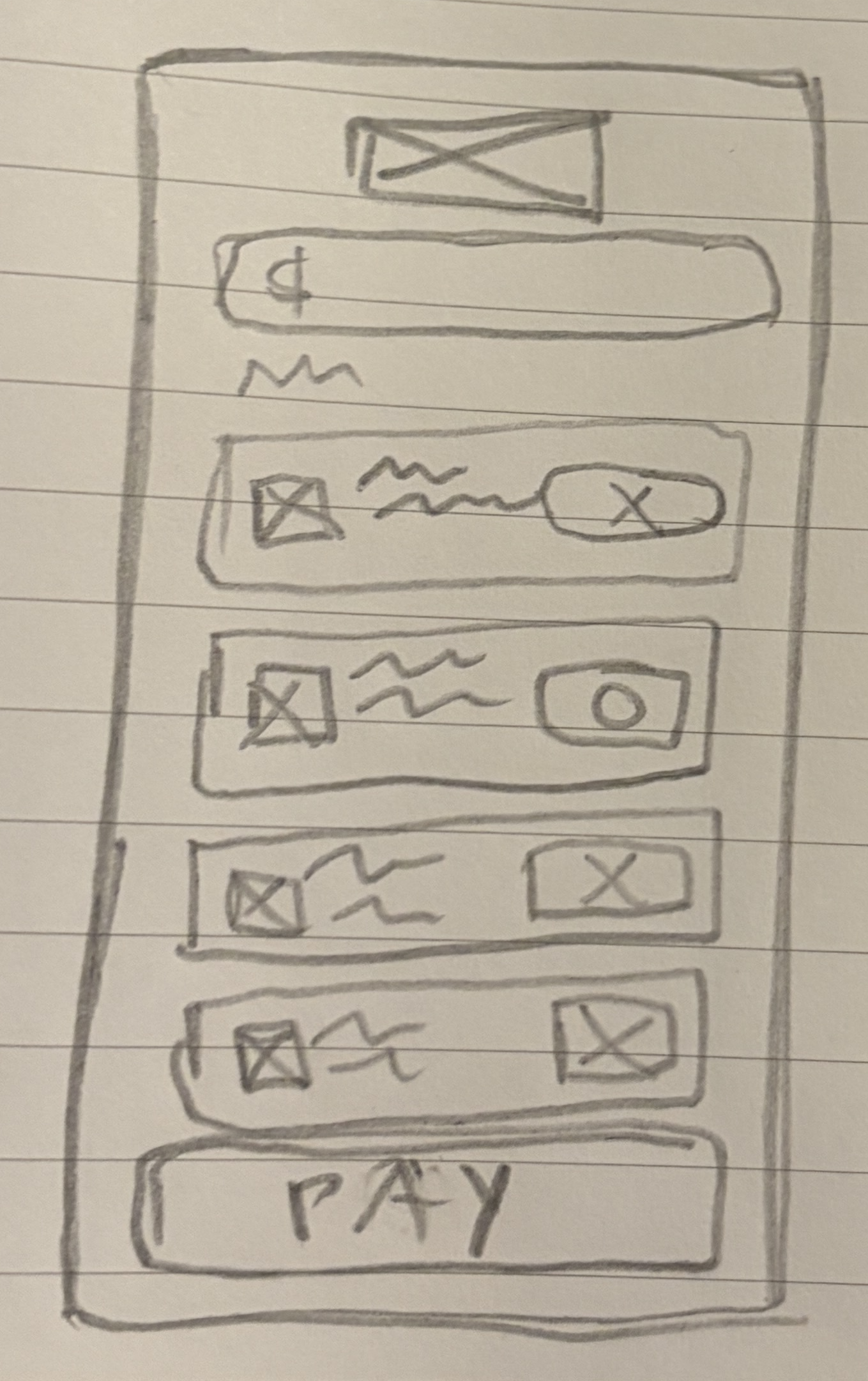
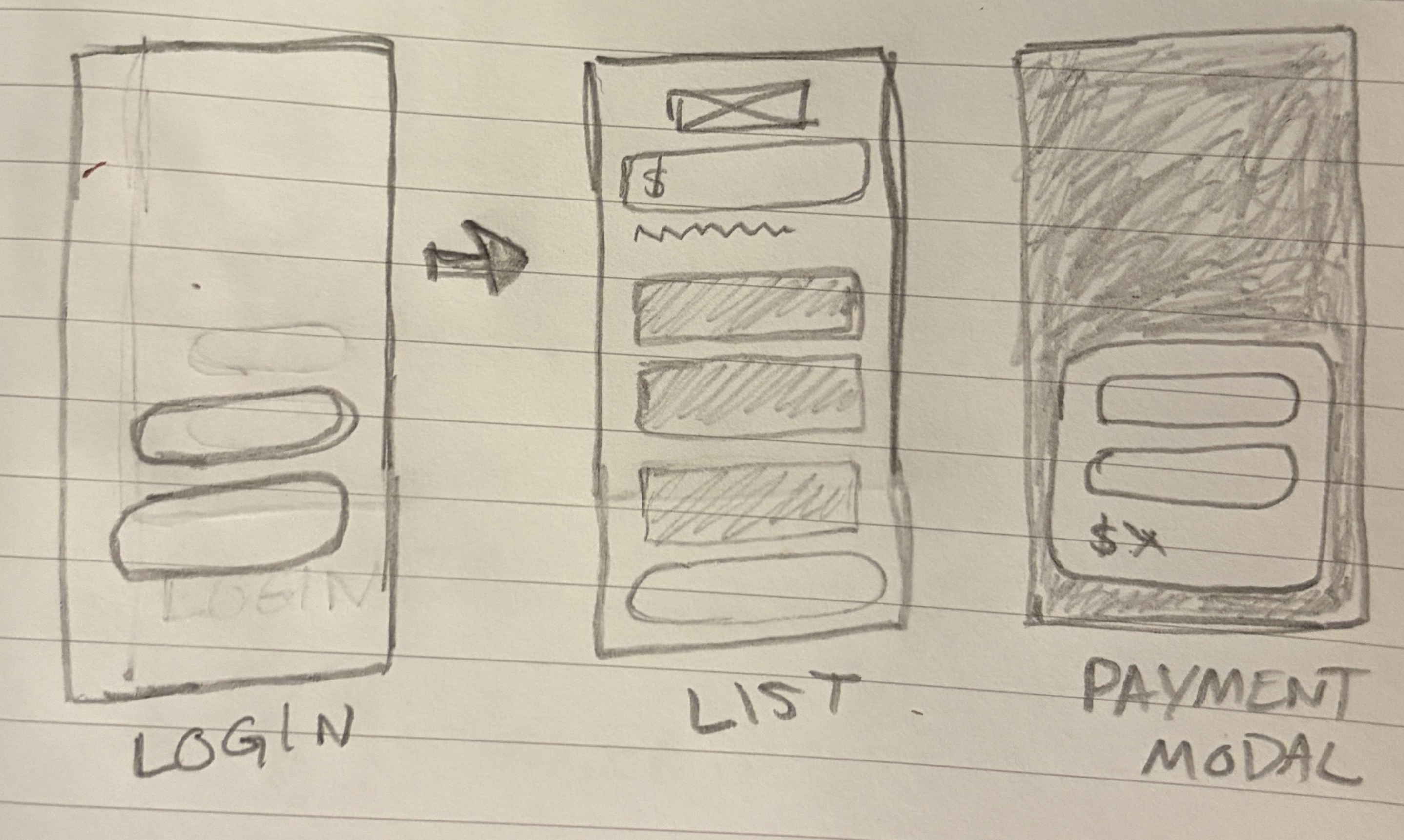
05 — EARLY EXPLORATION
Thinking it through on paper
Here I'm exploring ways to reduce the taps it takes to get from login to payment and start a machine.
Testing ways to simplify the machine list. Also, tinkering with how to surface availability at a glance, so users know instantly if a machine is free.
01 — THE PROBLEM
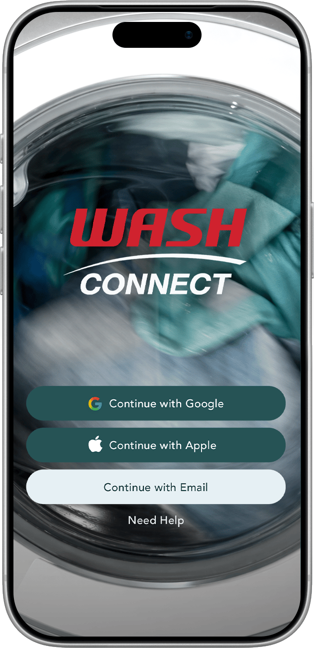
A simple login screen
for a simple task
Laundry is a chore, not a commitment. The redesigned login strips the screen down to just what's needed — login options and help — paired with a new hero image of laundry in motion.
06 — THE REDESIGN
A smoother way to
pick a machine
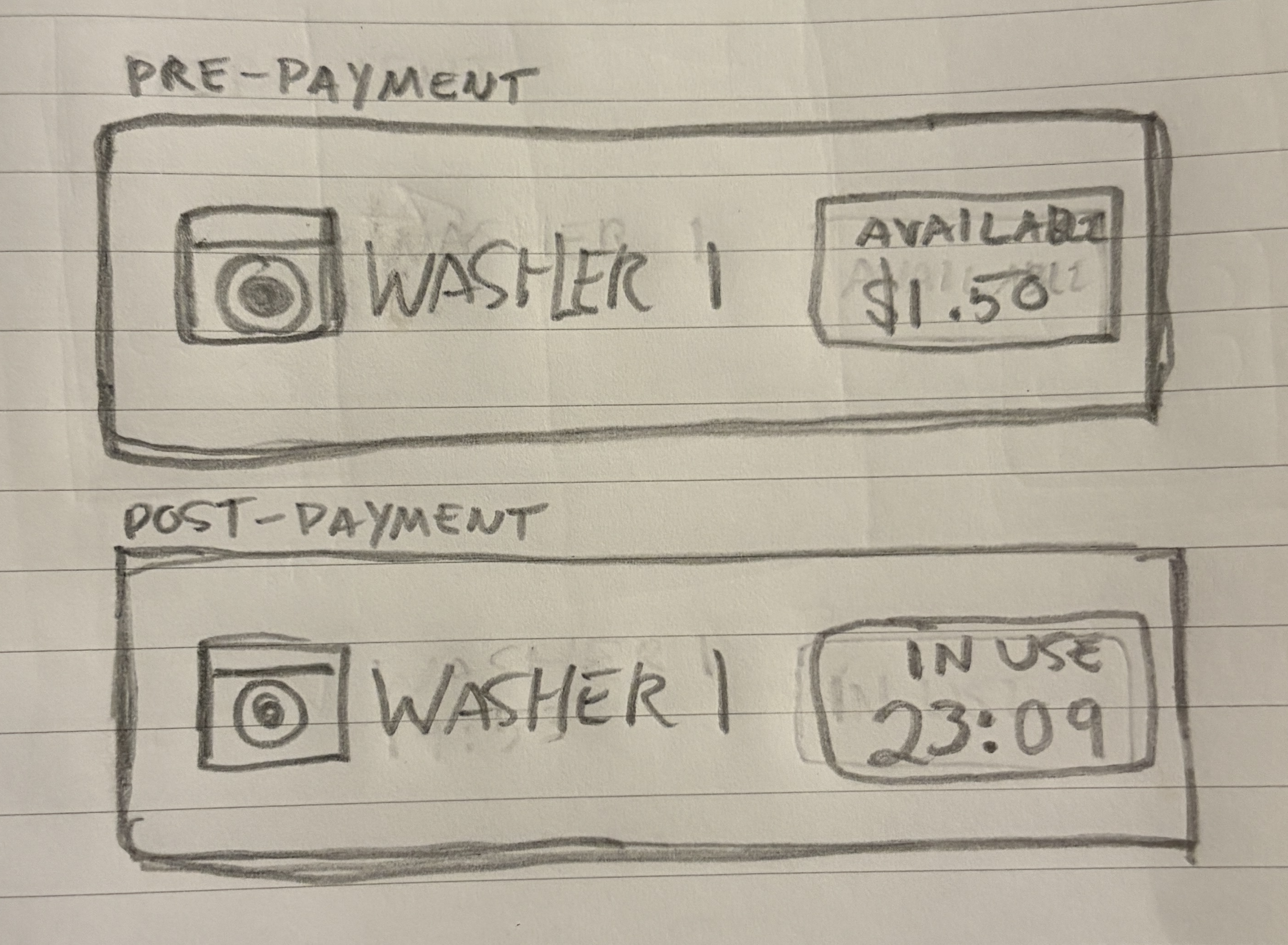
The redesigned list strips away the clutter. Pick a machine, pay, and go. Everything else collapses into a single gear icon. Each machine also now shows its status at a glance, available with a price, or in use with a countdown timer.
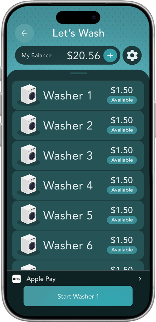

Fewer taps needed
4 steps → 2 steps
Less cognitive load
Streamlined flow

Clearer at a glance
Availability, price, and status


01 — THE PROBLEM
BEFORE
AFTER

A clunky start
Busy login with too many options upfront
Easy login
A clean, focuses entry gets users going
01 — THE PROBLEM
BEFORE
AFTER
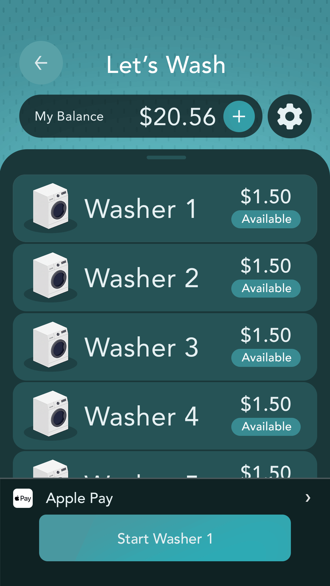
Big Buttons
Wasted space and way too many options
Simple list
Less noise helps you get straight to your next machine

The impact
Simplified flow from 4 steps to 1
Faster machine selection
More confident on-the-go use

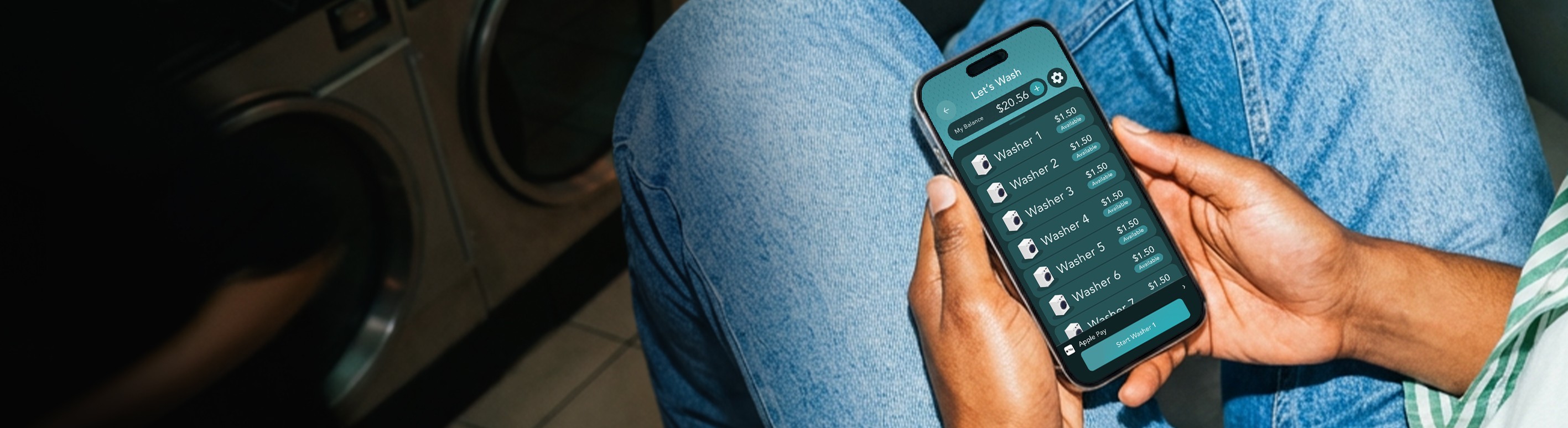

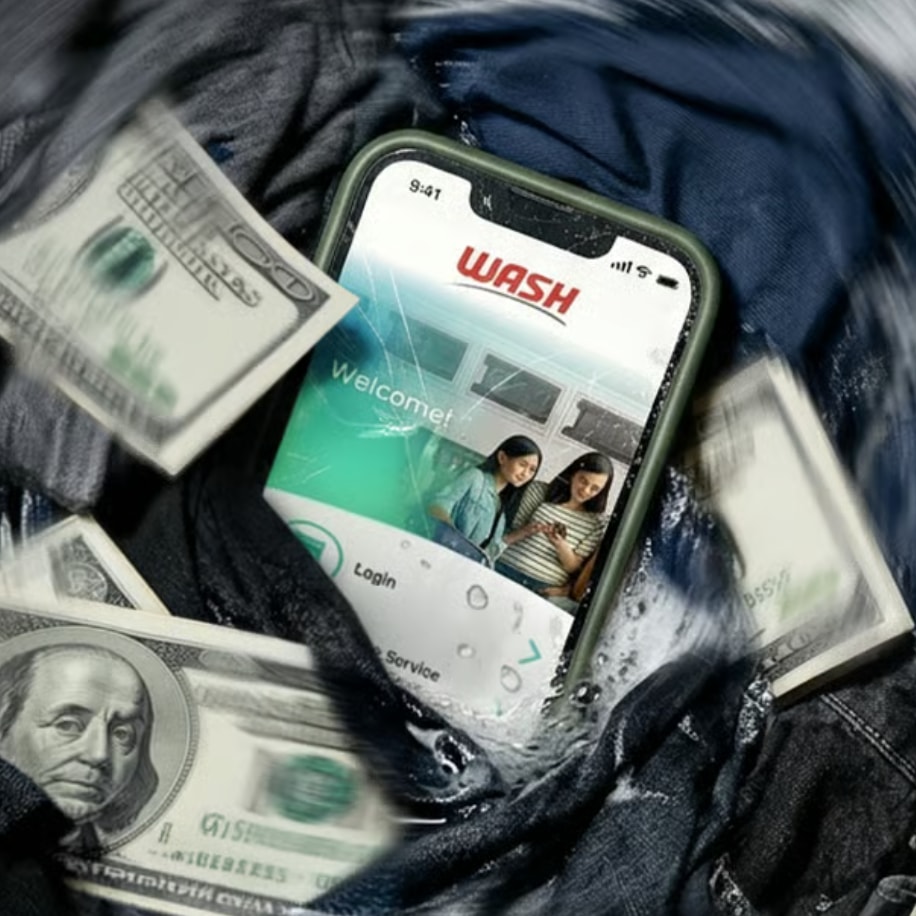
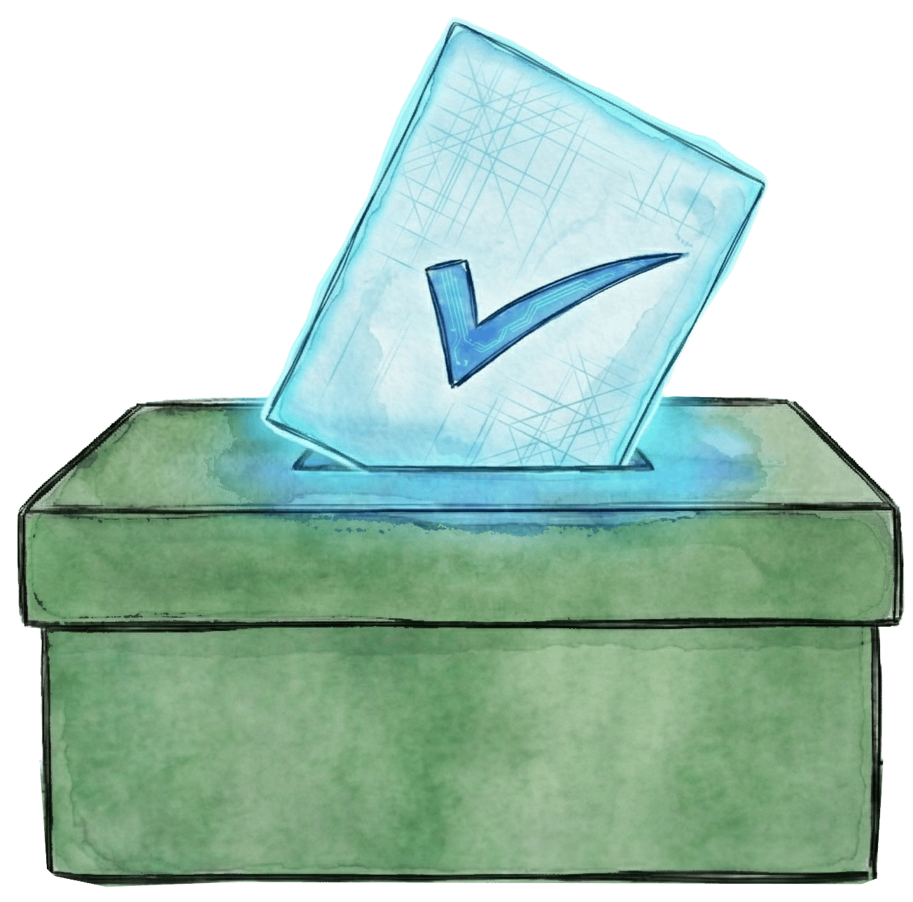
WASH CONNECT:
Removing friction in the payment flow so residents can get clean laundry faster
CASE STUDY

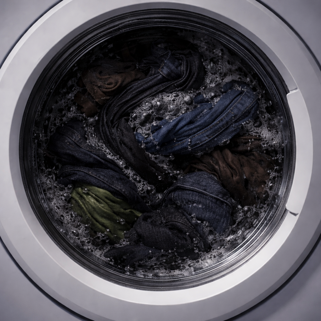
As smartphones reshaped everyday life, the laundry industry followed with landlords and property management companies swapping out coin-operated machines for app-based payment systems. Wash-Connect emerged as a dominant player in this space, securing widespread adoption across residential buildings nationwide. However, despite its market presence, the app's payment flow introduced unnecessary friction that made a routine task feel more
complicated than it needed to be. This case study documents a self-initiated UX redesign project focused on streamlining Wash-Connect's core payment experience. Throughout the process, I'll walk through the research, decisions, and design work I completed, while also noting where additional resources, such as direct user recruitment or stakeholder access, would have strengthened the process in a professional engagement.
HOME